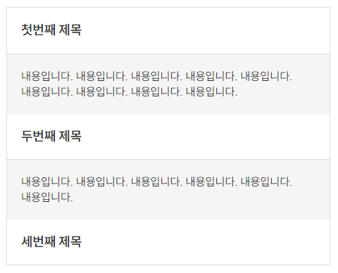
결과 화면


1. BaseAccordion 컴포넌트 만들기

  • components/base/BaseAccordion.vue

아코디언은 제목 부분을 클릭하면 내용 부분이 나타나는 레이아웃을 의미한다.

  1. title과 content로 나누어 html을 작성한다. 이때 content 부분은 펼쳐지는 느낌이 날 수 있도록 <transition> 컴포넌트를 이용한다.
  2. <transition> 컴포넌트의 @enter, @leave 메소드에 el.scrollHeight를 사용해서 내용에 따라서 높이값을 정할 수 있도록 한다.
  3. toggle 클릭 이벤트와 currentAccordion 속성을 이용해 title 부분을 클릭할 때마다 content 부분을 show/hide 시킨다.
  4. 공통으로 적용할 css/scss를 작성한다.
<template>
  <div class="base-accordion">
    <div
      class="title"
      @click="toggle">
      <slot name="title"/>
    </div>

    <transition
      name="accordion" appear
      @before-enter="beforeEnter" @enter="enter"
      @before-leave="beforeLeave" @leave="leave">
      <div
        v-show="currentAccordion"
        class="content">
        <slot name="content"/>
      </div>
    </transition>
  </div>
</template>

<script>
export default {
  name: 'BaseAccordion',

  data() {
    return {
      currentAccordion: false
    }
  },

  methods: {
    toggle() {
      this.currentAccordion = !this.currentAccordion
    },
    beforeEnter(el) {
      el.style.height = '0'
    },
    enter(el) {
      el.style.height = el.scrollHeight + 'px'
    },
    beforeLeave(el) {
      el.style.height = el.scrollHeight + 'px'
    },
    leave(el) {
      el.style.height = '0'
    }
  }
}
</script>

<style lang="scss" scoped>
.base-accordion {
  .title {
    padding: 20px;
    border-bottom: 1px solid #ddd;
    font-size: 16px;
    font-weight: 700;
    cursor: pointer;
  }

  .content {
    overflow: hidden;
    padding: 20px;
    background-color: #f5f5f5;
    transition: all 0.3s;
  }
}
</style>


2. 페이지에 BaseAccordion 컴포넌트 import 하기

  • pages/index.vue
  1. 만든 <BaseAccordion> 컴포넌트를 import 한다.
  2. <slot>으로 만든 부분에 내용이 들어갈 수 있도록 속성에 맞추어 내용을 작성한다.
<template>
  <TheLayout>
    <div class="accordion">
      <BaseAccordion>
        <h3 slot="title">첫번째 제목</h3>
        <p slot="content">
          내용입니다. 내용입니다. 내용입니다.
          내용입니다. 내용입니다. 내용입니다.
          내용입니다. 내용입니다. 내용입니다.
        </p>
      </BaseAccordion>

      <BaseAccordion>
        <h3 slot="title">두번째 제목</h3>
        <p slot="content">
          내용입니다. 내용입니다. 내용입니다.
          내용입니다. 내용입니다. 내용입니다.
        </p>
      </BaseAccordion>

      <BaseAccordion>
        <h3 slot="title">세번째 제목</h3>
        <p slot="content">
          내용입니다. 내용입니다. 내용입니다.
          내용입니다. 내용입니다. 내용입니다.
        </p>
      </BaseAccordion>
    </div>
  </TheLayout>
</template>

<script>
import TheLayout from '@/components/layout/TheLayout'
import BaseAccordion from '@/components/base/BaseAccordion'

export default {
  name: 'Main',

  components: {
    TheLayout,
    BaseAccordion
  }
}
</script>

<style lang="scss" scoped>
.accordion {
  border: 1px solid #ddd;

  .base-accordion::v-deep {
    &:last-child {
      .title {
        border-bottom: 0;
      }
    }
  }
}
</style>

결과 화면


1. BaseTab 컴포넌트 만들기

  • components/base/BaseTab.vue
  1. tab이 몇 개인지 모르니 배열 타입으로 props 받는다.
  2. key와 currentTab에 따라서 탭의 on/off 상태를 나타낸다.
  3. 클릭하면 탭이 변경되어야 하기 때문에 $emit으로 클릭 이벤트를 만든다.
  4. 공통으로 적용할 css/scss를 작성한다.
<template>
  <div class="base-tab">
    <ul>
      <li
        v-for="(item, key) in tab"
        :key="`tab-${key}`"
        :class="{ 'on': key === currentTab }"
        @click="$emit('click', key)">
        {{ item.name }}
      </li>
    </ul>
  </div>
</template>

<script>
export default {
  name: 'BaseTab',

  props: {
    tab: {
      type: Array,
      required: true
    },
    currentTab: {
      type: Number,
      default: 0
    }
  }
}
</script>

<style lang="scss" scoped>
.base-tab {
  margin-bottom: 30px;

  ul {
    display: flex;
    justify-content: start;
    align: center;
    gap:  20px;

    li {
      padding: 0 5px;
      border-bottom: 2px solid transparent;
      color: #888;
      font-size: 20px;
      font-weight: 700;
      transition: all 0.3s;
      cursor: pointer;

      &:hover {
        color: #333;
      }

      &.on {
        color: #333;
        border-bottom: 2px solid #333;
      }
    }
  }
}
</style>


2. 페이지에 BaseTab import 하기

  • pages/index.vue
  1. 만든 <BaseTab> 컴포넌트를 import 한다.
  2. currentTab, tab 속성을 만들어 <BaseTab>에 데이터를 넘긴다.
  3. changeTab() 클릭 이벤트를 만들어 currentTab이 <BaseTab>의 key 값과 동일하게 만든다.
  4. v-if를 통해서 currentTab 값에 따라 영역을 나타나고, 안 보이게 한다.
<template>
  <TheLayout>
    <BaseTab
      :tab="tab"
      :currentTab="currentTab"
      @click="changeTab"/>

    <section v-if="currentTab === 0">
      탭 1 영역입니다.
    </section>

    <section v-if="currentTab === 1">
      탭 2 영역입니다.
    </section>
  </TheLayout>
</template>

<script>
import TheLayout from '@/components/layout/TheLayout'

export default {
  name: 'Index',

  components: {
    TheLayout
  },

  data() {
    return {
      currentTab: 0,
      tab: [
        { name: '탭 1' },
        { name: '탭 2' }
      ]
    }
  },

  methods: {
    changeTab(key) {
      this.currentTab = key
    }
  }
}
</script>

결과 화면


1. BaseModal 컴포넌트 만들기

  • components/base/BaseModal.vue

<BaseModal> 컴포넌트는 여러 가지 모양의 모달에서 사용될 기본 틀이다.

  1. 모달의 경우, 주로 닫기 버튼과 제목, 내용 영역으로 구성되기 때문에 닫기 버튼과 <slot>으로 기본 레이아웃을 만든다.
  2. 모달 바깥쪽 영역과 닫기 버튼을 누르면 모달이 닫히는 이벤트가 필요하기 때문에 $emit 을 이용해 클릭 이벤트를 만든다.
  3. 공통으로 적용할 css/scss를 작성한다.
<template>
  <div
    class="base-modal"
    @click.self="$emit('close')">
    <div class="wrap">
      <BaseButton @click="$emit('close')">X</BaseButton>

      <div class="title">
        <slot name="title"/>
      </div>

      <div class="content">
        <slot name="content"/>
      </div>
    </div>
  </div>
</template>

<script>
import BaseButton from '@/components/base/BaseButton'

export default {
  name: 'BaseModal',

  components: {
    BaseButton
  }
}
</script>

<style lang="scss" scoped>
.base-modal {
  display: flex;
  justify-content: center;
  align-items: center;
  position: fixed;
  top: 0;
  right: 0;
  bottom: 0;
  left: 0;
  z-index: 1000;
  background-color: rgba(0, 0, 0, 0.5);

  .wrap {
    position: relative;
    width: 90%;
    max-width: 500px;
    min-height: 300px;
    background-color: #fff;
    border-radius: 16px;

    .base-button {
      position: absolute;
      top: 20px;
      right: 20px;
      font-size: 20px;
      font-weight: 700;
    }

    .title {
      margin: 20px auto;

      h3 {
        font-size: 26px;
        font-weight: 700;
        text-align: center;
      }
    }

    .content {
      p {
        font-size: 16px;
      }
    }
  }
}
</style>


2. 필요한 modal 컴포넌트 만들기

  • components/modal/ModalCookie.vue

<slot>을 사용해 모달 안의 내용을 작성한다.

해당 방식으로 여러 가지 모달을 만들 수 있다.

<template>
  <BaseModal @close="$emit('close')">
    <h3 slot="title">Cookie Modal</h3>
    <p slot="content">쿠키 모달입니다.</p>
  </BaseModal>
</template>

<script>
import BaseModal from '@/components/base/BaseModal'

export default {
  name: 'ModalCookie',

  components: {
    BaseModal
  }
}
</script>


3. 페이지에 modal import 하기

  • pages/index.vue
  1. 만든 <ModalCookie> 컴포넌트를 import 시킨다.
  2. isModalCookie 속성을 만들어 v-if가 true 이면 모달이 나타나고, false 이면 모달이 사라지게 만든다. 
  3. ModalCookieToggle 클릭 이벤트를 만든다.
<template>
  <TheLayout>
    <BaseButton @click="ModalCookieToggle">쿠키 모달 열기</BaseButton>

    <ModalCookie
      v-if="isModalCookie"
      @close="ModalCookieToggle"/>
  </TheLayout>
</template>

<script>
import TheLayout from '@/components/layout/TheLayout'
import BaseButton from '@/components/base/BaseButton'
import ModalCookie from '@/components/modal/ModalCookie'

export default {
  name: 'Main',

  components: {
    TheLayout,
    BaseButton,
    ModalCookie
  },

  data() {
    return {
      isModalCookie: false
    }
  },

  methods: {
    ModalCookieToggle() {
      this.isModalCookie = !this.isModalCookie
    }
  }
}
</script>

결과 화면


1. RouterName 변수 만들기

  • configs/router.js
  1. RouterName 변수(객체)를 만든다.
  2. 라우터 변수의 이름과 경로를 정의한다. (경로는 pages 폴더에 만든 .vue 파일의 경로와 동일하게 만든다.)

RouterName 변수 파일을 따로 만드는 이유는 피씨 메뉴, 모바일 메뉴, 사이트맵 등 여러 곳에서 사용했을 경우, 이름 또는 경로가 변경되면 여러 번 수정해야 하기 때문에 router 파일을 하나 만들어 import 시켜서 사용하면 한 번만 수정하면 된다.

export const RouterName = {
  MAIN: '/',
  SUB: '/sub',

  AUTH_LOGIN: '/auth/login'
}


2. TheHeader 컴포넌트 만들기

  • components/layout/TheHeader.vue
  1. <script> 태그에 { RouterName }을  import 시킨다.
  2. <script> 태그의 data() 영역에 navigation 변수(배열)를 만든다.
  3. name은 네비게이션 이름, to는 RouterName에 작성한 라우터 변수를 작성한다.
  4. <nav> 태그에 v-for를 사용해 네비게이션을 만든다.
<template>
  <header class="wrap">
    <nav>
      <NuxtLink
        v-for="(nav, key) in navigation"
        :key="`nav-${key}`"
        :to="{ path: `${nav.to}`}">
        {{ nav.name }}
      </NuxtLink>
    </nav>
  </header>
</template>

<script>
import { RouterName } from '@/configs/router'

export default {
  name: 'TheHeader',

  data() {
    return {
      navigation: [
        {
          name: '메인',
          to: RouterName.MAIN
        },
        {
          name: '서브',
          to: RouterName.SUB
        },
        {
          name: '로그인',
          to: RouterName.AUTH_LOGIN
        }
      ]
    }
  }
}

<style lang="scss" scoped>
header {
  ...
}
</style>


3. TheHeader 컴포넌트 import 시키기

  • components/layout/TheLayout.vue
<template>
  <div>
    <TheHeader/>

    <main class="wrap">
      <slot/>
    </main>

    <footer></footer>
  </div>
</template>

<script>
import TheHeader from '@/components/layout/TheHeader'

export default {
  name: 'TheLayout',

  components: {
    TheHeader
  }
}
</script>


  • pages/index.vue
<template>
  <TheLayout>
    <h1>메인 페이지</h1>
  </TheLayout>
</template>

<script>
import TheLayout from '@/components/layout/TheLayout'

export default {
  name: 'Main',

  components: {
    TheLayout
  }
}
</script>

v-if

v-if 디렉티비는 조건부로 블록을 렌더링 하고, 블록은 디렉티브 표현식이 ture 일 때만 렌더링 된다.


v-else

v-if에 대한 else 블록을 렌더링 하고, 블록은 디렉티브 표현식이 false 일 때만 렌더링 된다.


결과 화면


  • pages/index.vue

실제 프로젝트를 진행할 때에는 데이터(게시판, 공지사항 등)는 API로 받게 된다. 

데이터가 아무것도 없을 때에도 레이아웃을 보여주어야 하기 때문에 v-if와 v-else를 사용해 렌더링을 한다.


v-if 조건문에 맞춰 dataList 배열의 길이가 0이면 <h2> 태그를 렌더링 하고,

dataList 배열의 길이가 0이 아니라면 <ul> 태그를 렌더링 한다.

<template>
  <TheLayout>
    <h2 v-if="dataList.length === 0">데이터가 없습니다.</h2>

    <ul v-else>
      <li
        v-for="(list, key) in dataList"
        :key="`list-${key}`">
        <h2>{{ list.title }}</h2>
        <p>{{ list.content }}</p>
        <span>{{ list.date }}</span>
      </li>
    </ul>
  </TheLayout>
</template>

<script>
import TheLayout from "@/components/layout/TheLayout"

export default {
  name: 'Main',

  components: {
    TheLayout
  },

  data() {
    return {
      dataList: []
    }
  }
}
</script>

v-for

게시판의 게시글 리스트나 반복적인 내용을 보여줘야 할 때 v-for 디렉티브를 사용한다.

v-for="item in items":key 형태이다.

뷰에서 사용하는 for문이라고 생각하면 된다.


결과 화면


v-for 사용하기

  • pages/index.vue
  1. <script> 태그 안 data() 영역에 배열을 만든다. (dataList)
  2. <li> 태그가 반복되어야 하기 때문에 <li> 태그에 v-for와 :key를 작성한다.
  3. 중괄호 {{ ~ }} 안에 배열의 속성값을 작성한다.
<template>
  <TheLayout>
    <ul>
      <li
        v-for="(list, key) in dataList"
        :key="`list-${key}`">
        <h2>{{ list.title }}</h2>
        <p>{{ list.content }}</p>
        <span>{{ list.date }}</span>
      </li>
    </ul>
  </TheLayout>
</template>

<script>
import TheLayout from "@/components/layout/TheLayout"

export default {
  name: 'Main',

  components: {
    TheLayout
  },

  data() {
    return {
      dataList: [
        {
          title: 'Nuxt.js',
          content: 'Nuxt.js란, Vue.js 애플리케이션을 구축할 수 있는 오픈 소스 프레임워크이다.',
          date: '2023-10-01'
        },
        {
          title: 'Slot',
          content: '컴포넌트를 랜더링 할 때 html로 작성한 코드가 컴포넌트의 slot 부분으로 교체된다.',
          date: '2023-10-02'
        },
        {
          title: '뷰 SASS/SCSS 적용하기',
          content: 'sass/scss를 적용하고 싶은 .vue 파일에서 script 태그 아래에 style 태그를 작성한다.',
          date: '2023-10-03'
        }
      ]
    }
  }
}
</script>

props

props는 부모 컴포넌트의 데이터를 자식 컴포넌트로 전달한다.

부모 > 자식


emit

자식 컴포넌트에서 $emit 이벤트를 이용해 부모 컴포넌트에서 만들어 놓은 이벤트를 호출한다.

자식 > 부모


BaseButton 만들기

  1. BaseButton.vue 파일을 만들어 버튼을 공통으로 사용한다.
  2. class 속성을 props로 전달받아 css를 적용한다.
  3. $emit를 사용해 부모 컴포넌트에 작성한 이벤트를 호출한다.


결과 화면


1. BaseButton 컴포넌트 만들기

  • components/base/BaseButton.vue (자식 컴포넌트)
  1. :class="[color]" color 라는 속성을 만들어 부모 컴포넌트에서 색상 값을 전달받는다. (배열 형태로 만들면 여러 가지 값을 전달받을 수 있다.)
  2. <script> 태그 안 props 부분에 color에 대한 타입을 정의한다. (타입을 정의하지 않으면 잘못된 값을 전달받았을 때 콘솔 오류가 발생한다.)
  3. 전달받은 color에 대한 css를 작성한다. (.red, .blue)
  4. @click="$emit('click')" $emit을 이용해 클릭 이벤트를 호출한다. (클릭 이벤트는 부모 컴포넌트에 만든다.)
<template>
  <button
    type="button"
    :class="[color]"
    @click="$emit('click')">
    <slot/>
  </button>
</template>

<script>
export default {
  name: 'BaseButton',

  props: {
    color: {
      type: String,
      required: false
    }
  }
}
</script>

<style lang="scss" scoped>
button {
  width: 150px;
  height: 40px;

  &.red {
    background-color: red;
  }

  &.blue {
    background-color: blue;
  }
}
</style>


2. BaseButton 컴포넌트 사용하기

  • pages/index.vue (부모 컴포넌트)
  1. <BaseButton> 컴포넌트를 import 한다.
  2. <BaseButton> 컴포넌트에 color 속성을 작성한다. (color="red", color="blue")
  3. @click 메서드를 통해 클릭 이벤트를 호출한다.
  4. <script> 태그 안 methods 부분에 클릭 이벤트를 작성한다. (redAlert(), blueAlert())
<template>
  <TheLayout>
    <BaseButton
      color="red"
      @click="redAlert">
      빨간색 버튼
    </BaseButton>

    <BaseButton
      color="blue"
      @click="blueAlert">
      파란색 버튼
    </BaseButton>
  </TheLayout>
</template>

<script>
import TheLayout from "@/components/layout/TheLayout"
import BaseButton from "@/components/base/BaseButton"

export default {
  name: 'Main',

  components: {
    TheLayout,
    BaseButton
  },

  methods: {
    redAlert() {
      alert('빨간색 버튼')
    },

    blueAlert() {
      alert('파란색 버튼')
    }
  }
}
</script>

1. sass, sass-loader 설치하기

터미널에서 아래 명령어를 실행한다.

package.json 파일에서 설치된 버전을 확인할 수 있다.

yarn add sass sass-loader

또는

npm install sass sass-loader


2. style 작성하기

  • pages/index.vue

sass/scss를 적용하고 싶은 .vue 파일에서 <script> 태그 아래에 <style> 태그를 작성한다.

<template>
  <TheLayout>
    <h1>메인 페이지</h1>
  </TheLayout>
</template>

<script>
import TheLayout from "@/components/layout/TheLayout"

export default {
  name: 'Main',

  components: {
    TheLayout
  }
}
</script>

<style lang="scss" scoped>
  h1 {
    color: blue
  }
</style>


3. scss 적용이 안됐을 경우

버전 차이로 인해 sass-loader가 작동을 안 할 때가 있다.

sass-loader를 삭제 후, 버전 10을 설치한다.

// 삭제하기
yarn remove sass-loader

// 버전 10 설치하기
yarn add sass-loader@10


4. reset.scss 등 전역 scss 적용하기

  • static/css/common.scss

reset, font, layout 등 공통으로 적용하고 싶은 scss 파일이 있다면 매번 스타일을 작성하거나 import 시키는 것보다 전역에서 적용하는 것이 효율적이다.

위의 경로에 common.scss 파일을 만들고, 공통으로 적용하고 싶은 scss 파일을 import 시킨다.

// base
@import './base/reset';
@import './base/font';

// common
@import './common/layout';
@import './common/transition';

...


5. nuxt.config.js

nuxt.config.js 파일을 열고, css 부분에 common.scss 파일을 작성한다.

common.scss에 import 시켜둔 모든 scss 파일이 전역에서 적용된 것을 확인할 수 있다.

export default {
  ...
  
  // Global CSS: https://go.nuxtjs.dev/config-css
  css: [
    '@/static/css/common.scss'
  ],
  
  ...
}


6. 결과 화면

slot, 슬롯이란

컴포넌트를 랜더링 할 때 html로 작성한 코드가 컴포넌트의 <slot></slot> 부분으로 교체된다.


1. 레이아웃 컴포넌트 만들기

  • components/layout/TheLayout.vue

<header>, <footer>는 공통으로 사용하고, <main> 영역만 변경하고 싶어 <slot>을 사용했다.

<template>
  <div>
    <header>헤더</header>

    <main>
      <slot/>
    </main>

    <footer>푸터</footer>
  </div>
</template>

<script>
export default {
  name: 'TheLayout'
}
</script>


2. 레이아웃 컴포넌트 import 시키기

  • pages/index.vue

<h1> 이라고 작성한 부분이 <TheLayout> 컴포넌트의 <slot> 영역으로 교체된다.

<template>
  <TheLayout>
    <h1>메인 페이지</h1>
  </TheLayout>
</template>

<script>
import TheLayout from "@/components/layout/TheLayout"

export default {
  name: 'Main',

  components: {
    TheLayout
  }
}
</script>


3. 결과 화면

Nuxt.js란

Nuxt.js란, Vue.js 애플리케이션을 구축할 수 있는 오픈 소스 프레임워크이다.

Nuxt.js 공식 문서: https://nuxt.com/

  • 코드 분할
  • SSR, SPA 등 렌더링 결정 가능
  • 서버 측 렌더링
  • 최적화된 이미지
  • SEO


1. npm init nuxt-app

터미널에서 아래 명령어를 실행하고, 나오는 옵션들을 선택한다.

프로젝트 이름, Javascript/Typescript 언어 선택 등을 설정할 수 있다.

잘 모르겠으면 전부 앤터를 누른다.

npm init nuxt-app 프로젝트 이름


2. 로컬호스트 연결 확인하기

설치한 프로젝트로 이동 또는 프로젝트를 열고, 터미널에서 아래 명령어를 실행한다.

yarn dev

또는

yarn build
yarn start


3. 결과 화면

로컬 호스트 접속 후, 아래 화면이 나온다면 로컬호스트 연결에 성공한 것이다.


4. 폴더 구조

+ Recent posts