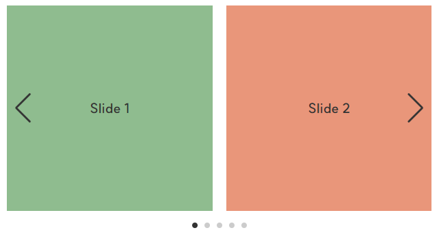
결과 화면

버전
vue: 2.7.10
nuxt: 2.15.8
vue, nuxt 버전 2.x.x 기준으로 작성한 글이기 때문에 버전 3.x.x에서는 동작하지 않을 수 있다.
2023.11 기준 스와이퍼 버전 11까지 나왔다.
최신 버전의 뷰 스와이퍼에 대한 자세한 설명은 공식 문서를 참고한다.
1. swiper, vue-awesome-swiper 패키기 설치하기
swiper와 vue-awesome-swiper 패키지를 설치한다.
반드시 해당 버전으로 설치한다.
yarn add swiper@5.4.5
yarn add vue-awesome-swiper@4.1.1

또는

npm install swiper@5.4.5
npm install vue-awesome-swiper@4.1.1
2. 마크업 하기
- pages/swiper.vue
- 컴포넌트가 아닌 HTML로 마크업 한다. 이때 class명은 swiper 패키지에서 제공하는 것으로 사용한다.
(swiper-container, swiper-wrapper, swiper-slide) - 커스텀으로 autoplay, progress를 만들 것이기 때문에 마찬가지로 HTML로 마크업 한다.
autoplay 속성의 true/false에 따라서 css가 바뀌어야 하기 때문에 클릭 이벤트와 :class 속성을 추가한다.
<template>
  <section class="kv-swiper">
    <div
      v-once
      v-swiper:swiper="kvSwiperOption"
      class="swiper-container">
      <ul class="swiper-wrapper">
        <li class="swiper-slide">Slide 1</li>
        <li class="swiper-slide">Slide 2</li>
        <li class="swiper-slide">Slide 3</li>
      </ul>
    </div>

    <div class="swiper-function">
      <div
        class="swiper-autoplay"
        :class="{ stop: kvAutoplay }"
        @click="kvSwiperAutoplay">
        <span/>
      </div>

      <div
        class="swiper-progress"
        :class="{ start: kvProgress }">
        <span class="bar"/>
      </div>

      <div class="swiper-pagination"/>
    </div>
  </section>
</template>
3. script 작성하기
- v-once, v-swiper 디렉티브를 사용하기 위해서 vue 컴포넌트를 import 한다.
- vue-awesome-swiper와 swiper.css를 import 한다.
- kvAutoplay, kvProgress를 false로 설정한다. (페이지가 로딩되기 전에 동작되면 안 되기 때문에)
- kvSwiperOption을 작성한다. kvSwiperOption의 on 부분에 autoplay에 관한 메서드를 작성한다.
(다음 슬라이드로 넘길 때 autoplay와 progress를 초기화하기 위해서)
스와이퍼의 다양한 속성들을 사용하고 싶으면 공식 문서를 참고한다. (https://swiperjs.com/demos) - autoplay와 progress 동작에 필요한 메서드를 작성한다. 이때 try/catch 구조로 작성해야 한다.
<script>
import Vue from 'vue'
import VueAwesomeSwiper from 'vue-awesome-swiper'
import 'swiper/css/swiper.css'

Vue.use(VueAwesomeSwiper)

export default {
  name: 'SwiperPage',

  data() {
    return {
      // Kv autoplay, progress
      kvAutoplay: false,
      kvProgress: false,

      // Kv swiper option
      kvSwiperOption: {
        effect: 'fade',
        slidesPerView: 1,
        spaceBetween: 0,
        loop: true,
        autoplay: {
          delay: 5000
        },
        pagination: {
          el: '.swiper-pagination',
          type: 'fraction'
        },
        on: {
          init: this.init,
          sliderMove: this.stopAutoplay,
          slideChangeTransitionStart: this.stopAutoplay,
          transitionEnd: this.startAutoplay
        }
      }
    }
  },

  methods: {
    init() {
      this.kvProgress = true
    },

    kvSwiperAutoplay() {
      this.kvAutoplay = !this.kvAutoplay

      if (this.kvProgress) {
        this.stopAutoplay()
      } else {
        this.startAutoplay()
      }
    },

    stopAutoplay() {
      try {
        this.swiper.autoplay.stop()
        this.kvProgress = false
      } catch (err) {
        console.error(err)
      }
    },

    startAutoplay() {
      try {
        this.swiper.autoplay.start()
        this.kvProgress = true
        this.kvAutoplay = false
      } catch (err) {
        console.error(err)
      }
    }
  }
}
</script>
4. css/scss 작성하기
- progress는 script의 autoplay 속도와 css의 keyframes과 animation 속도에 맞춰 움직일 수 있도록 css를 작성한다. (animation: kvProgress 5s linear infinite;)
- 스와이퍼에 필요한 css를 작성한다.
<style lang="scss" scoped>
@keyframes kvProgress {
  from {
    transform: translateX(-100%);
  }
  to {
    transform: translateX(0);
  }
}

.kv-swiper {
  position: relative;
  height: 300px;
  padding: 20px;

  .swiper-container {
    height: 100%;

    .swiper-slide {
      ...
    }
  }

  .swiper-function {
    ...

    .swiper-autoplay {
      position: relative;
      cursor: pointer;

      span {
        &::after {
          position: absolute;
          top: 50%;
          left: 50%;
          transform: translate(-50%, -50%);
          width: 4px;
          height: 12px;
          border-left: 2px solid #fff;
          border-right: 2px solid #fff;
          content: '';
        }
      }

      &.stop {
        span {
          &::after {
            width: 0;
            height: 0;
            border-right: 0;
            border-left: 10px solid #fff;
            border-top: 6px solid transparent;
            border-bottom: 6px solid transparent;
          }
        }
      }
    }

    .swiper-progress {
      overflow: hidden;
      width: 300px;
      height: 4px;
      background-color: rgba(255, 255, 255, 0.5);
      border-radius: 4px;

      &.start {
        .bar {
          animation: kvProgress 5s linear infinite;
        }
      }

      .bar {
        display: block;
        width: 100%;
        height: 4px;
        transform: translateX(-100%);
        background-color: #fff;
      }
    }

    .swiper-pagination {
      ...
    }
  }
}
</style>'Vue, Nuxt > 문법' 카테고리의 다른 글
| [Vue/Nuxt] Nuxt.js 깃허브 페이지 배포하기 (0) | 2023.12.04 |
|---|---|
| [Vue/Nuxt] 뷰 swiper와 svg를 이용해서 autoplay, progress 페이지네이션 만들기 (vue swiper custom pagination) (0) | 2023.11.07 |
| [Vue/Nuxt] 뷰 swiper 이용해서 슬라이드 만들기 (vue swiper 사용법) (0) | 2023.11.07 |
| [Vue/Nuxt] 뷰 mounted() 이용해서 이미지에 효과 넣기 (0) | 2023.11.02 |
| [Vue/Nuxt] 뷰 셀렉트 박스 만들기 (셀렉트 박스 커스텀하기, custom select box) (1) | 2023.11.02 |