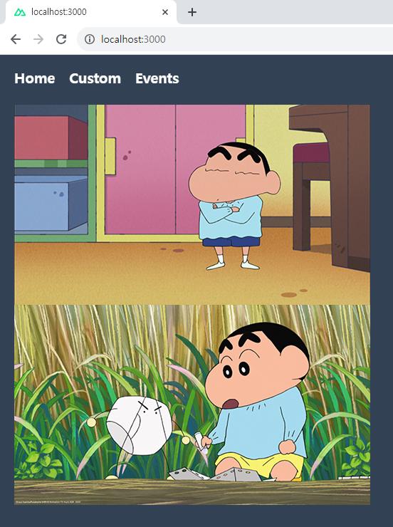
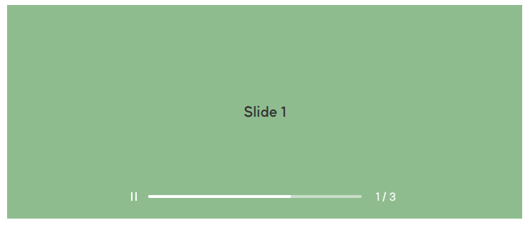
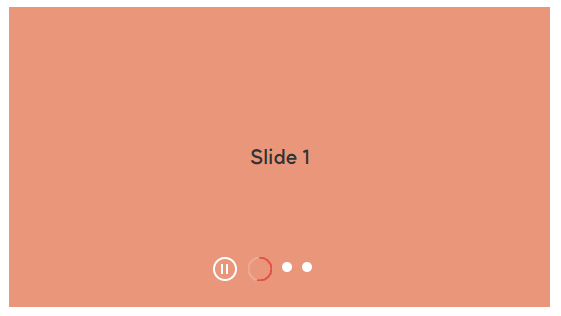
Middlewares with Nuxt 3 — Course part 8

https://www.youtube.com/watch?v=PhuJE0ayD6A&list=PL8HkCX2C5h0XT3xWYn71TlsAAo0kizmVc&index=8


유튜브 강의를 참고하고 있습니다.


Middleware란

Nuxt에서 미들웨어(Middleware)는 페이지나 레이아웃이 렌더링 되기 전에 호출되는 커스텀 훅(Hook)이다.

store, route, params, query, redirect 등에 접근할 수 있기 때문에 내비게이션 가드 형태로 미들웨어 제작이 가능하다.

쉽게 말해 특정 경로로 이동하기 전에 실행하려는 코드를 만들 때 이상적이다.


1. middleware 폴더 만들기

  • middleware/auth.global.ts

middleware 폴더 안에 파일을 만들 때 파일명 뒤에 .global을 붙이면 별도의 import 없이 전역에서 사용할 수 있는 미들웨어가 된다.

export default defineNuxtRouteMiddleware((to, from) => {
  console.log(to)
  console.log(from)
})


2. auth.global.ts (글로벌 미들웨어)

  • middleware/auth.global.ts

글로벌로 만든 미들웨어에서 navigateTo를 이용해 리다이렉트를 할 경우, isLoggedIn이 계속 false이기 때문에 무한 리다이렉트에 빠져 주의해야 한다.

export default defineNuxtRouteMiddleware((to, from) => {
  let isLoggedIn = false

  if(isLoggedIn) {
    return navigateTo(to.fullPath)
  } else {
    return navigateTo('/auth')
  }
})


3. auth.ts (페이지 정의 미들웨어)

  • pages/index.vue
  1. auth.global.ts 미들웨어에서 .global을 지운다.
  2. auth.ts 미들웨어를 사용할 페이지에 import 한다.
  3. / 루트 페이지에 접속하면 바로 /auth 페이지로 이동됨을 볼 수 있다.
<template>
  <h1>Main page</h1>
</template>

<script setup lang="ts">
definePageMeta({
  middleware: 'auth'
})
</script>

Plugins with Nuxt 3 — Course part 7

https://www.youtube.com/watch?v=9MCVjsq35I8&list=PL8HkCX2C5h0XT3xWYn71TlsAAo0kizmVc&index=7


유튜브 강의를 참고하고 있습니다.


Plugins이란

Nuxt에는 Vue 애플리케이션 생성 시 Vue 플러그인을 사용할 수 있는 플러그인 시스템이 있다.

Nuxt는 자동으로 plugins 디렉터리 파일을 읽고, Vue 애플리케이션 생성 시 이를 로드한다.


1. plugins 폴더 만들기

  • plugins/myPlugins.ts
export default defineNuxtPlugin((nuxtApp) => {
  return {
    provide: {
      hello: (msg: string) => console.log(`Hello ${msg}`)
    }
  }
})


2. 플러그인 import 하기

plugins 디렉터리 최상위에 있는 파일(또는 하위 디렉터리 내의 index 파일)은 별로의 import 없이 자동으로 플러그인으로 등록된다.


  • pages/index.vue
<script setup lang="ts">
console.log(useNuxtApp())
</script>


3. 플러그인 사용하기

  • pages/index.vue
<script setup lang="ts">
const { $hello } = useNuxtApp()

$hello('world')
</script>


Composables with Nuxt 3 — Course part 6

https://www.youtube.com/watch?v=cWX4b2qD6sg&list=PL8HkCX2C5h0XT3xWYn71TlsAAo0kizmVc&index=6


유튜브 강의를 참고하고 있습니다.


Composables이란

Vue 애플리케이션에서 composable(컴포저블)이란, Vue의 Composition API를 활용하여 상태 저장 논리를 캡슐화하고 재사용하는 함수를 의미한다.

함수의 이름은 'use'로 시작하고, 카멜 케이스 형식으로 지정한다.


1. composables 폴더 만들기

  • composables/useUtils.ts
export const useUtils = () => {
  const sayHello = () => console.log('Hello from useHello')

  return {
    sayHello
  }
}


2. useUtils 함수 불러오기

  • pages/index.vue
<script setup lang="ts">
import { useUtils } from "~/composables/ussUtils";

const { sayHello } = useUtils()

sayHello()
</script>


결과 화면


VueUse란

VueUse 모듈은 Vue Composition(컴포지션, import 한 함수를 사용해서 Vue 컴포넌트를 작성할 수 있는 API) 유틸리티 모음이다.

VueUse에 대한 자세한 설명을 아래 공식 문서를 참고한다.

https://vueuse.org/

https://nuxt.com/modules/vueuse


VueUse 설치하기

터미널에서 아래 명령어를 실행한다.

설치된 버전은 package.json 파일에서 확인할 수 있다.

npm i -D @vueuse/nuxt @vueuse/core


  • nuxt.config.ts

모듈 부분에 @vueuse/nuxt를 import 한다.

export default defineNuxtConfig({
  devtools: { enabled: true },
  modules: [
    '@vueuse/nuxt'
  ],
  css: ['@/assets/scss/main.scss'],
  postcss: {
    plugins: {
      tailwindcss: {},
      autoprefixer: {}
    }
  }
})


1. useMouse

  • pages/index.vue
<template>
  <div>Mouse position: {{ x }}, {{ y }}</div>
</template>

<script setup lang="ts">
import { useMouse } from '@vueuse/core'

const { x, y } = useMouse()
</script>


2. useLocalStorage

  • pages/index.vue
<script setup lang="ts">
import { useLocalStorage } from '@vueuse/core'

const store = useLocalStorage(
    'my-storage',
    {
      name: 'Apple',
      color: 'red'
    }
)
</script>


3. usePreferredDark

  • pages/index.vue
<script setup lang="ts">
import { usePreferredDark } from '@vueuse/core'

const isDark = usePreferredDark()

console.log(isDark)

if(isDark.value) {
  console.log('다크모드 true')
} else {
  console.log('다크모드 false')
}
</script>


4. useTitle

  • pages/index.vue
<template>
  <h1>{{ themeTitle }}</h1>
</template>

<script setup lang="ts">
import { usePreferredDark, useTitle } from '@vueuse/core'

const isDark = usePreferredDark()

const themeTitle = useTitle(() => isDark.value ? '다크모드 true' : '다크모드 false')
</script>


5. onClickOutside

  • pages/index.vue
<template>
  <div ref="el">
    Click Outside of Me
  </div>
</template>

<script setup lang="ts">
import { ref } from 'vue'
import { onClickOutside } from '@vueuse/core'

const el = ref()

function close () {
  alert('영역의 바깥을 클릭했습니다.')
}

onClickOutside(el, close)
</script>

Images, assets & public folder with Nuxt 3 — Course part 5

https://www.youtube.com/watch?v=tWQ2LWplmDc&list=PL8HkCX2C5h0XT3xWYn71TlsAAo0kizmVc&index=5


유튜브 강의를 참고하고 있습니다.


1. assets 폴더에 이미지 올리기

assets 폴더에 images 폴더를 만들고 이미지를 올린다.


  • pages/index.vue

~ 또는 @를 이용해서 루트 경로를 설정하면 된다.

<template>
  <img src="~/assets/images/1.jpg" alt="이미지1">
  <img src="@/assets/images/2.jpg" alt="이미지2">
</template>


assets 폴더에 넣은 이미지는 빌드돼서 이미지가 업로드되기 때문에 직접적인 접근이 불가능하다.


2. public 폴더에 이미지 올리기

public 폴더에 images 폴더를 만들고 이미지를 올린다.


public 폴더에 넣은 이미지는 서버 루트에서 그대로 제공되기 때문에 직접적인 접근이 가능하다.

단, public 폴더는 모두가 접근할 수 있기 때문에 안전 이슈가 발생할 수 있어 주의해서 사용해야 한다.


Layouts with Nuxt 3 — Course part 4

https://www.youtube.com/watch?v=GQjU4FfM3II&list=PL8HkCX2C5h0XT3xWYn71TlsAAo0kizmVc&index=4


유튜브 강의를 참고하고 있습니다.


1. DefaultLayout 만들기

  1. layouts 폴더를 만들고, 그 안에 default.vue 파일을 만든다.
  2. <slot>을 사용해 pages/~.vue 파일의 내용을 <slot> 부분으로 대체한다.


  • layouts/default.vue

layouts 폴더 안에 defalut.vue 파일을 만들면 별도의 import 없이 자동으로 DefalutLayout이 된다.

<template>
  <div class="h-screen p-5 bg-slate-700 text-base text-white">
    <Header/>

    <slot/>
  </div>
</template>


  • pages/index.vue
<template>
  <h1>index page</h1>
</template>


  • app.vue
<template>
  <NuxtLayout>
    <NuxtPage/>
  </NuxtLayout>
</template>


2. CustomLayout 만들기

  1. DefaultLayout 말고, 다른 레이아웃을 만들고 싶을 때 layout 폴더 안에 custom.vue 파일을 만든다.
  2. CustomLayout은 기본 레이아웃이 아니기 때문에 <script> 태그 안에 정의를 해야 한다.


  • layouts/custom.vue
<template>
  <div class="h-screen p-5 bg-slate-500 text-base text-white">
    <h1 class="text-lg font-bold">Custom layout</h1>

    <slot/>
  </div>
</template>


  • pages/custom.vue
<template>
  <h1>Custom page</h1>
</template>

<script setup lang="ts">
definePageMeta({
  layout: "custom"
})
</script>


결과 화면


Components with Nuxt 3 — Course part 3

https://www.youtube.com/watch?v=o4SkcTupZBo&list=PL8HkCX2C5h0XT3xWYn71TlsAAo0kizmVc&index=3


유튜브 강의를 참고하고 있습니다.


1. components 폴더 만들기

components 폴더를 만들고, 그 안에 vue 파일을 만든다.

컴포넌트로 사용할 vue 파일의 첫 글자 이름은 반드시 대문자로 한다.


  • components/Alert.vue
<template>
  <div class="p-2 bg-slate-500 rounded text-white text-lg font-bold">
    This is an alert component.
  </div>
</template>


  • components/Profile/Header/Avatar.vue
<template>
  <div class="p-2 bg-slate-700 rounded text-white text-lg font-bold">
    This is a Profile/Header/Avatar component.
  </div>
</template>


2. 컴포넌트 import 하기

nuxt3에는 auto-importing 기능이 있어 별도의 import문 없이 바로 컴포넌트를 사용할 수 있다.


파일명이 컴포넌트의 이름이 되고, 뎁스 안에 있는 컴포넌트는 '폴더명 폴더명 ... 파일명' 으로 이름을 지으면 된다.

'components/Profile/Header/Avatar.vue' 의 경우 <ProfileHeaderAvatar>가 컴포넌트의 이름이 된다.


  • pages/index.vue
<template>
  <Alert/>

  <ProfileHeaderAvatar/>
</template>


결과 화면


Pages & Routing with Nuxt 3 — Course part 2

https://www.youtube.com/watch?v=tdgUDuD3fS4&list=PL8HkCX2C5h0XT3xWYn71TlsAAo0kizmVc&index=2


유튜브 강의를 참고하고 있습니다.


1. pages 폴더 만들기

pages 폴더를 만들고, 그 안에 ~.vue 파일을 만들면 http://localhost:3000/ 주소에서 500 에러가 발생한다.

pages 폴더가 만들어지면 app.vue 파일에서 pages/~.vue 파일과 경로를 매칭하지 못하기 때문이다.


2. app.vue 파일 수정하기

  • app.vue
  1. <NuxtLayout>, <NuxtPage> 컴포넌트를 이용해 pages/~.vue 파일들이 <NuxtPage> 태그 대신에 보이도록 한다.
  2. <header> 태그를 추가해서 모든 pages/~.vue 파일에서 <header> 태그가 import 되게 만든다.
  3. <style> 태그를 추가해서 css를 적용한다.
<template>
  <NuxtLayout>
    <div class="wrap">
      <header>
        <ul>
          <li>
            <NuxtLink to="/">Home</NuxtLink>
            <NuxtLink to="/events">Events</NuxtLink>
          </li>
        </ul>
      </header>

      <NuxtPage/>
    </div>
  </NuxtLayout>
</template>

<style lang="scss" scoped>
header {
  ul {
    height: 50px;

    li {
      display: flex;
      justify-content: start;
      align-items: center;
      gap: 20px;

      a {
        font-size: 20px;
        font-weight: 700;
      }
    }
  }
}
</style>


3. vue 파일 만들기

  • pages/index.vue
<template>
  <div>index page</div>
</template>


  • pages/event/index.vue
<template>
  <div>events page</div>
</template>


결과 화면

Create an app with Nuxt 3 — Course part 1
https://www.youtube.com/watch?v=hj3NNlTqIJg&list=PL8HkCX2C5h0XT3xWYn71TlsAAo0kizmVc&index=1


유튜브 강의를 참고하고 있습니다.


Nuxt는 Vue.js를 사용하여 안전하고 성능이 뛰어난 풀 스택 웹 애플리케이션과 웹 사이트를 만들 수 있는 직관적이고 확장 가능성을 가진 무료 오픈 소스 프레임워크이다.

  • 서버 측 렌더링(빠른 페이지 로드 시간, 캐싱, SEO)
  • 파일 기반 라우팅
  • Auto-imports 컴포넌트
  • 타입스크립트 지원


1. Nuxt 3 설치하기

필수 조건

Node.js v18.0.0 이상


터미널에서 아래 명령어를 실행 후, 설치가 완료되면 해당 폴더로 이동한다.

npx nuxi init <project-name>

// 가장 최신 버전을 설치하고 싶으면
npx nuxi@latest init <project-name>


2. 로컬호스트 연결 확인하기

터미널에서 yarn dev 명령어를 실행하고, 아래 사진과 같은 화면이 나온다면 로컬호스트 연결에 성공한 것이다.


3. app.vue 수정하기

  • app.vue

app.vue 파일은 로컬호스트에서 보이는 메인 화면이다.

<NuxtWelcome> 컴포넌트를 삭제하고, 다른 태그를 작성하면 화면이 수정된 것을 볼 수 있다.

<template>
  <NuxtWelcome></NuxtWelcome>
</template>

<script setup lang="ts">
</script>


4. 테일윈드 CSS 설치하기

https://tailwindcss.com/docs/guides/nuxtjs

Nuxt 테일윈드 CSS 설치에 대한 자세한 설명은 위의 공식문서를 참고한다.


터미널에서 아래 명령어를 실행한다.

npm install -D tailwindcss postcss autoprefixer
npx tailwindcss init


  • assets/scss/main.scss
@tailwind base;
@tailwind components;
@tailwind utilities;


  • nuxt.config.ts
// https://nuxt.com/docs/api/configuration/nuxt-config
export default defineNuxtConfig({
  devtools: { enabled: true },
  css: ['@/assets/scss/main.scss'],
  postcss: {
    plugins: {
      tailwindcss: {},
      autoprefixer: {}
    }
  }
})


  • app.vue
<template>
  <h1 class="text-3xl font-bold underline">
    Hello world!
  </h1>
</template>


결과 화면


결과 화면


버전

vue: 2.7.10

nuxt: 2.15.8


vue, nuxt 버전 2.x.x 기준으로 작성한 글이기 때문에 버전  3.x.x에서는 동작하지 않을 수 있다.


2023.11 기준 스와이퍼 버전 11까지 나왔다.

최신 버전의 뷰 스와이퍼에 대한 자세한 설명은 공식 문서를 참고한다.

https://swiperjs.com/vue


1. swiper, vue-awesome-swiper 패키기 설치하기

swiper와 vue-awesome-swiper 패키지를 설치한다.

반드시 해당 버전으로 설치한다.

yarn add swiper@5.4.5
yarn add vue-awesome-swiper@4.1.1

또는

npm install swiper@5.4.5
npm install vue-awesome-swiper@4.1.1


2. 마크업 하기

  • pages/swiper.vue
  1. 컴포넌트가 아닌 HTML로 마크업 한다. 이때 class명은 swiper 패키지에서 제공하는 것으로 사용한다.
    (swiper-container, swiper-wrapper, swiper-slide)
  2. 커스텀으로 autoplay, progress를 만들 것이기 때문에 마찬가지로 HTML로 마크업 한다.
    autoplay 속성의 true/false에 따라서 css가 바뀌어야 하기 때문에 클릭 이벤트와 :class 속성을 추가한다.
<template>
  <section class="kv-swiper">
    <div
      v-once
      v-swiper:swiper="kvSwiperOption"
      class="swiper-container">
      <ul class="swiper-wrapper">
        <li class="swiper-slide">Slide 1</li>
        <li class="swiper-slide">Slide 2</li>
        <li class="swiper-slide">Slide 3</li>
      </ul>
    </div>

    <div class="swiper-function">
      <div
        class="swiper-autoplay"
        :class="{ stop: kvAutoplay }"
        @click="kvSwiperAutoplay">
        <span/>
      </div>

      <div
        class="swiper-progress"
        :class="{ start: kvProgress }">
        <span class="bar"/>
      </div>

      <div class="swiper-pagination"/>
    </div>
  </section>
</template>


3. script 작성하기

  1. v-once, v-swiper 디렉티브를 사용하기 위해서 vue 컴포넌트를 import 한다.
  2. vue-awesome-swiper와 swiper.css를 import 한다.
  3. kvAutoplay, kvProgress를 false로 설정한다. (페이지가 로딩되기 전에 동작되면 안 되기 때문에)
  4. kvSwiperOption을 작성한다. kvSwiperOption의 on 부분에 autoplay에 관한 메서드를 작성한다.
    (다음 슬라이드로 넘길 때 autoplay와 progress를 초기화하기 위해서)
    스와이퍼의 다양한 속성들을 사용하고 싶으면 공식 문서를 참고한다. (https://swiperjs.com/demos
  5. autoplay와 progress 동작에 필요한 메서드를 작성한다. 이때 try/catch 구조로 작성해야 한다.
<script>
import Vue from 'vue'
import VueAwesomeSwiper from 'vue-awesome-swiper'
import 'swiper/css/swiper.css'

Vue.use(VueAwesomeSwiper)

export default {
  name: 'SwiperPage',

  data() {
    return {
      // Kv autoplay, progress
      kvAutoplay: false,
      kvProgress: false,

      // Kv swiper option
      kvSwiperOption: {
        effect: 'fade',
        slidesPerView: 1,
        spaceBetween: 0,
        loop: true,
        autoplay: {
          delay: 5000
        },
        pagination: {
          el: '.swiper-pagination',
          type: 'fraction'
        },
        on: {
          init: this.init,
          sliderMove: this.stopAutoplay,
          slideChangeTransitionStart: this.stopAutoplay,
          transitionEnd: this.startAutoplay
        }
      }
    }
  },

  methods: {
    init() {
      this.kvProgress = true
    },

    kvSwiperAutoplay() {
      this.kvAutoplay = !this.kvAutoplay

      if (this.kvProgress) {
        this.stopAutoplay()
      } else {
        this.startAutoplay()
      }
    },

    stopAutoplay() {
      try {
        this.swiper.autoplay.stop()
        this.kvProgress = false
      } catch (err) {
        console.error(err)
      }
    },

    startAutoplay() {
      try {
        this.swiper.autoplay.start()
        this.kvProgress = true
        this.kvAutoplay = false
      } catch (err) {
        console.error(err)
      }
    }
  }
}
</script>


4. css/scss 작성하기

  1. progress는 script의 autoplay 속도와 css의 keyframes과 animation 속도에 맞춰 움직일 수 있도록 css를 작성한다. (animation: kvProgress 5s linear infinite;)
  2. 스와이퍼에 필요한 css를 작성한다.
<style lang="scss" scoped>
@keyframes kvProgress {
  from {
    transform: translateX(-100%);
  }
  to {
    transform: translateX(0);
  }
}

.kv-swiper {
  position: relative;
  height: 300px;
  padding: 20px;

  .swiper-container {
    height: 100%;

    .swiper-slide {
      ...
    }
  }

  .swiper-function {
    ...

    .swiper-autoplay {
      position: relative;
      cursor: pointer;

      span {
        &::after {
          position: absolute;
          top: 50%;
          left: 50%;
          transform: translate(-50%, -50%);
          width: 4px;
          height: 12px;
          border-left: 2px solid #fff;
          border-right: 2px solid #fff;
          content: '';
        }
      }

      &.stop {
        span {
          &::after {
            width: 0;
            height: 0;
            border-right: 0;
            border-left: 10px solid #fff;
            border-top: 6px solid transparent;
            border-bottom: 6px solid transparent;
          }
        }
      }
    }

    .swiper-progress {
      overflow: hidden;
      width: 300px;
      height: 4px;
      background-color: rgba(255, 255, 255, 0.5);
      border-radius: 4px;

      &.start {
        .bar {
          animation: kvProgress 5s linear infinite;
        }
      }

      .bar {
        display: block;
        width: 100%;
        height: 4px;
        transform: translateX(-100%);
        background-color: #fff;
      }
    }

    .swiper-pagination {
      ...
    }
  }
}
</style>

결과 화면


버전

vue: 2.7.10

nuxt: 2.15.8


vue, nuxt 버전 2.x.x 기준으로 작성한 글이기 때문에 버전  3.x.x에서는 동작하지 않을 수 있다.


2023.11 기준 스와이퍼 버전 11까지 나왔다.

최신 버전의 뷰 스와이퍼에 대한 자세한 설명은 공식 문서를 참고한다.

https://swiperjs.com/vue


1. swiper, vue-awesome-swiper 패키기 설치하기

swiper와 vue-awesome-swiper 패키지를 설치한다.

반드시 해당 버전으로 설치한다.

yarn add swiper@5.4.5
yarn add vue-awesome-swiper@4.1.1

또는

npm install swiper@5.4.5
npm install vue-awesome-swiper@4.1.1


2. Swiper, SwiperSlide 컴포넌트 사용해서 마크업 하기

  • pages/swiper.vue
  1. 슬라이드 부분은 <Swiper>와 <SwiperSlide> 컴포넌트를 사용해서 마크업 한다.
  2. autoplay 버튼과 pagination 부분은 HTML로 마크업 한다.
  3. autoplay의 true/false에 따라 css가 달라져야 하기 때문에 :class 속성을 추가한다.
<template>
  <section class="kv-swiper">
    <Swiper
      :options="kvSwiperOptions"
      ref="kvSwiper">
      <SwiperSlide>Slide 1</SwiperSlide>
      <SwiperSlide>Slide 2</SwiperSlide>
      <SwiperSlide>Slide 3</SwiperSlide>
    </Swiper>

    <div class="kv-function">
      <div
        class="swiper-autoplay"
        :class="{ stop: kvAutoplay }"
        @click="kvSwiperAutoplay">
        <span/>
      </div>
      <div
        class="swiper-pagination"
        :class="{ stop: kvPagination }"
        slot="pagination"/>
    </div>
  </section>
</template>


3. script 작성하기

  1. Swiper, SwiperSlide 컴포넌트와 swiper.css 파일을 import 한다.
  2. 커스텀 페이지네이션을 만들기 위해서 kvSwiperOptions의 pagination 부분에 renderBullet 속성을 추가한다.
  3. renderBullet 부분에 <svg> 태그를 사용해서 기존 페이지네이션 태그 대신에 <svg> 태그가 대신 렌더링 되게 한다.
  4. autoplay와 pagination 동작에 필요한 메서드를 작성한다.
<script>
import { Swiper, SwiperSlide } from 'vue-awesome-swiper'
import 'swiper/css/swiper.css'

export default {
  name: 'SwiperPage',

  components: {
    Swiper,
    SwiperSlide
  },

  data() {
    return {
      // kv autoplay, pagination
      kvAutoplay: false,
      kvPagination: false,

      // kv swiper options
      kvSwiperOptions: {
        effect: 'fade',
        slidesPerView: 1,
        spaceBetween: 0,
        loop: true,
        autoplay: {
            delay: 3800,
            disableOnInteraction: false
        },
        pagination: {
          el: '.swiper-pagination',
          clickable: true,
          paginationType: 'custom',
          renderBullet: function () {
            return `<div class="swiper-pagination-bullet">
              <svg viewBox="0 0 48 48" width="24" height="24" xml:space="preserve" id="svg">
                <circle class="pagination-loader" cx="24" cy="24" r="23" stroke="#da291c" fill="none" stroke-width="4" stroke-linecap="round"></circle>
                <circle class="pagination-circle" cx="24" cy="24" r="23" stroke="#fff" fill="none" stroke-width="4" stroke-linecap="round"></circle>
              </svg>
            </div>`
          }
        }
      }
    }
  },

  computed: {
    kvSwiper() {
      return this.$refs.kvSwiper.$swiper
    }
  },

  methods: {
    kvSwiperAutoplay() {
      this.kvAutoplay = !this.kvAutoplay
      this.kvPagination = !this.kvPagination

      if (this.kvAutoplay) {
        this.kvSwiper.autoplay.stop()
      } else {
        this.kvSwiper.autoplay.start()
      }
    }
  }
}
</script>


4. css/scss 작성하기

움직이는 svg 이미지를 만들기 위해서는 css가 매우 중요하다.


stroke-dasharray 속성은 선을 dash(점선) 형태로 만든다.

dasharray 값은 점선을 만드는 간격을 의미하고, 숫자가 작아질수록 점선이 촘촘하다.


stroke-dashoffset 속성은 svg 이미지가 어떤 지점부터 시작할지 정해준다.

시작점은 시계방향의 90도이다.

또한 dash 값들은 svg 태그의 path 값과 관련이 있어 글로 된 설명보다는 직접 숫자를 수정해 가며 결과로 확인하는 것이 낫다. 


@keyframe, animation을 사용해서 svg 이미지가 움직일 수 있도록 css를 작성한다.

<style lang="scss" scoped>
@keyframes loading {
  0% {
    stroke-dashoffset: 192;
  }
  100% {
    stroke-dashoffset: 0;
  }
}

.kv-swiper {
  position: relative;
  height: 300px;

  .swiper-container {
    height: 100%;

    .swiper-slide {
      ...
    }
  }

  .kv-function {
    position: absolute;
    left: 50%;
    bottom: 30px;
    z-index: 1;
    transform: translateX(-50%);

    .swiper-autoplay {
      ...
    }

    .swiper-pagination::v-deep {
      position: relative;

      .swiper-pagination-bullet {
        width: 10px;
        height: 10px;
        margin: 0 5px;
        background-color: #fff;
        opacity: 1;
        cursor: pointer;

        svg {
          display: none;
          transform: rotate(-90deg);

          .pagination-loader {
            stroke-dasharray: 192;
            stroke-dashoffset: 192;
            animation: loading 5s linear infinite;
          }

          .pagination-circle {
            stroke-opacity: 0.2;
          }
        }
      }

      .swiper-pagination-bullet-active {
        width: 24px;
        height: 15px;
        background-color: transparent;

        svg {
          display: block;
        }
      }

      &.stop {
        .swiper-pagination-bullet {
          svg {
            .pagination-loader {
              stroke: none;
              animation-play-state: paused;
            }
          }
        }
      }
    }
  }
}
</style>

+ Recent posts